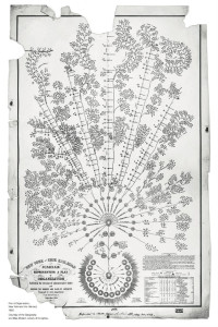
The First Org Chart Ever Made Is a Masterpiece of Data Design
By Liz Stinson
WIRED, 03.18.14
EXTRACT

As the Erie Railway grew, so did the amount of data it had to wrangle: which superintendents were responsible for which set of tracks; schedule changes; who the various conductors, laborers and brakemen worked under. As Caitlin Rosenthal writes over at McKinsey Quarterly, if any one data point was mismanaged it could bring dire results: “One delayed train, for example, could disrupt the progress of many others. And the stakes were high: with engines pulling cars in both directions along a single set of rails, schedule changes risked the deadly crashes that plagued 19th-century railroads.”
This flowery organizational chart was created by Daniel McCallum, the company’s general manager, to efficiently deliver critical information and delegate tasks to the right person. Instead of a top-down structure, the chart flows from its roots like a tree. The power was centralized with the president and board of directors as its anchor, but much of the day-to-day responsibility over the tracks was allocated to lower-level superintendents. The reasoning for this, Rosenthal writes: “They possessed the best operating data, were closer to the action, and thus were best placed to manage the line’s persistent inefficiencies.”
See Also:
Graphic: Real Organizational Chart
Review: The Hidden Power of Social Networks–Understanding How Work Really Gets Done in Organizations


