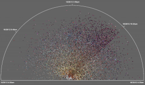
Radical Visualization of Photos Posted to Instagram During Hurricane Sandy
This data visualization (click to enlarge) displays more than 23,500 photos taken in Brooklyn and posted to Instagram during Hurricane Sandy. A picture’s distance from the center (radius) corresponds to its mean hue while a picture’s position along the perimeter (angle) corresponds to the time that picture was taken. ”Note the demarcation line that reveals the moment of a power outage in the area and indicates the intensity of the shared experience (dramatic decrease in the number of photos, and their darker colors to the right of the line)” (1).

Read full article with additional graphics.
Phi Beta Iota: Each dot is an actual photograph with time and space tag. It is the first step toward streaming video from aggregated individual hand-held camera shots.


