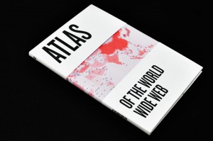
Dafna Aizenberg's Atlas of the World Wide Web visualizes data taken from the internet. Image: Dafna Aizenberg
A traditional atlas can tell you a lot about a place—its population, its religious affiliations, its geographical quirks—but it tends to ignore a major aspect of daily life in 2013: the internet. For the past 30 years, the our digital lives, or lack thereof, have increasingly become a defining factor in how countries are perceived. Accordingly, Israel-based designer Dafna Aizenberg felt that it was time for a 21st century update to classic atlas maps. “Recently I’ve found myself exploring the social implications of the internet on our lives,” she explains. “Both the positive and negative aspects that come with it.” Aizenberg created the Atlas of the World Wide Web, a 120-page visual guide to how the internet has blurred the traditional, physical borders around the world. The atlas’ six chapters, which span everything from IP addresses to internet infrastructure to e-commerce, feature striking visualizations that highlight often unnoticed trends brought on by the spread of the internet.
Though Aizenberg’s images are densely packed with information, the design is clean and clear. “Inspired from generative design, I used basic shapes that change according to the data,” she explains. “The challenge was to create a generative system without any computer-generated graphics, as I wanted to have full control over each map.” Each chapter looks and feels totally different from the next, which Aizenberg says was an important aspect of the project. “Although the entire Atlas needed to keep the same general aesthetics, it was clear that each chapter has to adapt itself to the subject at hand and be unique,” she says. For example, the cybercrime chapter uses darker colors, which aim to communicate the negative atmosphere, while the shapes used in the spread on email spam are meant to give a feeling of disorientation.
Aizenberg’s book reinforces some longstanding trends in global inequality. Her IP address distribution chart in particular illustrates how technological advancements sharply divided countries into the haves and have-nots. Using open source data, Aizenberg charted the number of addresses per country—as the number of IP addresses rise, the color of the country darkens. Places like the United States show up as a deep-hued red, while parts of Africa nearly disappear from the map altogether.
“Working on the atlas strengthened my feelings that the world is still very much apart and divided between regions and cultures which are technologically superior and others which are having a real hard time catching up in terms of internet availability and penetration levels,” she says. Still, the atlas reveals some surprising facts, like despite the United States being home to two of the most famous social media sites, its social connectivity pales in comparison to other countries around the world. “I was certain of the U.S. being the most socially occupied country, but it didn’t even make it into the top 10,” she says. “One explanation could be that the U.S. is not all about NYC and the Silicon Valley in California, but also about other regions, which are less tech savvy.” An astute observation, indeed.
Atlas of the World Wide Web isn’t currently for sale (interested publishers are welcome to get in touch), but you can check out more of her visualizations on Cargo Collective.


