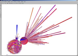
My issue with any visualization, however brilliant, is that it assumes that it will engage consensus and action.
Missing is the recognition that even if we had a hard data visualization that one million people were to die tomorrow somewhere — even in New York — the level of engagement would be low. Who says so? Is it a scam? Is it spin? etc
There is a glass ceiling effect which is not addressed, irrespective of the nature of the crisis. Central Arica ciurrently offers an example. Increasingly, who cares, or why should I care? I walk pass beggars everyday. What is not evident from such visualization is what it is expected that anyone should do and why. My first take on this was:
Remedial Capacity Indicators Versus Performance Indicators
My second was:
The Earth is not moved by good visualizations !
My think piece on big data:
using networks of international organizations, world problems, strategies, and values
Abstract: The paper reports briefly on the ongoing process of systematic information collection and web presentation by the UIA of networks of over 30,000 international organizations, 56,000 perceived world problems, 32,000 advocated action strategies, and some 3,000 values — resulting in a total of 800,000 hyperlinks. These different entities constitute an interesting focal sub-system of whatever is to be understood by an emerging global brain – for which the “problems” might be understood as “neuroses”, if not “tumours”.

Preliminary NetMap Studies of Databases on Questions, World Problems, Global Strategies, and Values
See Also:


