900 Years of Tree Diagrams, the Most Important Data Viz Tool in History
By Kyle VanHemert
WIRED, 04.08.14
You’d be excused for thinking infographics are a modern invention. We’ve witnessed an explosion of data visualization in the last half decade, and only occasionally are we reminded of the field’s historical forebears, like Florence Nightingale’s polar area diagram of causes of death in the Civil War from 1858, or Charles Joseph Minard’s sophisticated flow map of Napoleon’s ruinous Russian campaign, published in 1869.

A new book by designer Manuel Lima, however, shows that data viz’s roots go much deeper–some 900 years, at the very least. And calling them “roots” is very much appropriate.
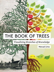
The Book of Trees: Visualizing Branches of Knowledge catalogs a stunning diversity of illustrations and graphics that rely on arboreal models for representing information. It’s a visual metaphor that’s found across cultures throughout history–a data viz tool that has outlived empires and endured huge upheavals in the arts and sciences.
Continue reading “900 Years of Tree Diagrams, the Most Important Data Viz Tool in History”


