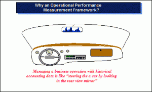
Graphic: Why Operational Performance Data?
Budgets & Funding, Innovation, Processing, Strategy-Holistic CoherenceJosh Kilbourn: Visualizing the True Cost of War
Budgets & Funding, Capabilities-Force Structure, Corruption, Political, True Cost
While we have shown some quite fascinating infographics (here and here) from the folks at Demonocracy, this one may be the most informative. Because while everyone knows by now that if the global “bailout” to preserve the insolvent ponzi were to be paid in crisp, physical $100 bills, the amount of money required would fill countless skyscrapers, and only pales compared to the the amount of money needed to fund the insolvent welfare state which at last check was at over a quarter of a quadrillion, it is another less appreciated aspect of the daily US spending routine that is arguably just as big an offender when it comes to endless wanton spending: the cost of war. Below we present just that, in a series of simple, easy to understand charts that even Nobel peace prize winners should grasp.
The true cost of war:
ADMIN: New Graphics on Usury as Economy Killer
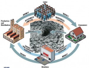
Budgets & Funding, CorruptionGraphic: Theft One – Black Hole of Unwarranted Interest
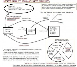
Graphic: Theft Two – Unwarranted Interest as Drain on Economy
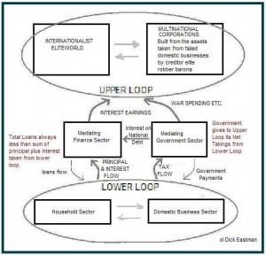
Graphic: Theft Three – Sucking Sound from “Above”
Graphic: Theft Four – Sucking Sounds Explained
Graphic: Theft Five – Chronic Deflation
Graphic: Theft Six – Eastman Model of Toxic Usury


