Colleagues at GNIP and MapBox recently published this high-resolution map of iPhone, Android and Blackberry users in the US (click to enlarge). “More than 280 million Tweets posted from mobile phones reveal geographic usage patterns in unprecedented detail.” These patterns are often insightful. Some argue that “cell phone brands say something about socio-economics – it takes a lot of money to buy a new iPhone 5,” for example (1). So a map of iPhone users based on where these users tweet reveals where relatively wealthy people live.
Large-scale events leave an unquestionable mark on social media. This was true of Hurricane Sandy, for example, and is also true of the widespread protests in Egypt this week. On Wednesday, the Egyptian Military responded to the large-scale demonstrations against President Morsi by removing him from power. Can Twitter provide early warning signals of growing political tension in Egypt and elsewhere? My QCRI colleagues Ingmar Weber & Kiran Garimella and Al-Jazeera colleague Alaa Batayneh have been closely monitoring (PDF) these upheavals via Twitter since January 2013. Specifically, they developed a Political Polarization Index that provides early warning signals for increased social tensions and violence. The analysis & graphs below include the very latest data and I will keep updating this post with new data over the next 24 hours.
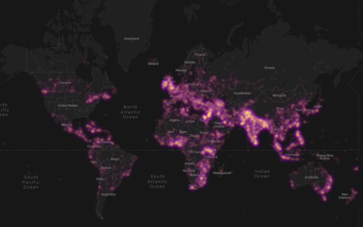
My colleague Kalev Leetaru recently launched GDELT (Global Data on Events, Location and Tone), which includes over 250 million events ranging from riots and protests to diplomatic exchanges and peace appeals. The data is based on dozens of news sources such as AFP, AP, BBC, UPI, Washington Post, New York Times and all national & international news from Google News. Given the recent wave of protests in Cairo and Istanbul, a collaborator of Kalev’s, John Beieler, just produced this digital dynamic map of protests events thus far in 2013. John left out the US because “it was a shining beacon of protest activity that distracted from the other parts of the map.”
I recently caught up with Gilal Lotan during a hackathon in New York and was reminded of his good work during Sandy, the largest Atlantic hurricane on record. Amongst other analytics, Gilal created a dynamic map of tweets referring to power outages. “This begins on the evening October 28th as people mostly joke about the prospect of potentially losing power. As the storm evolves, the tone turns much more serious. The darker a region on the map, the more aggregate Tweets about power loss that were seen for that region.” The animated map is captured in the video below.
. . . . . .
In sum, creating live maps of geo-tagged tweets is only a first step. Base-maps should be rapidly developed and overlaid with other datasets such as population and income distribution. Of course, these datasets are not always available acessing historical Twitter data can also be a challenge. The latter explains why Big Data Philanthropy for Disaster Response is so key.
Artificial Intelligence (AI) can be used to automatically predict the credibility of tweets generated during disasters. AI can also be used to automatically rank the credibility of tweets posted during major events. Aditi Gupta et al. applied these same information forensics techniques to automatically identify fake images posted on Twitter during Hurricane Sandy. Using a decision tree classifier, the authors were able to predict which images were fake with an accuracy of 97%. Their analysis also revealed retweets accounted for 86% of all tweets linking to fake images. In addition, their results showed that 90% of these retweets were posted by just 30 Twitter users.
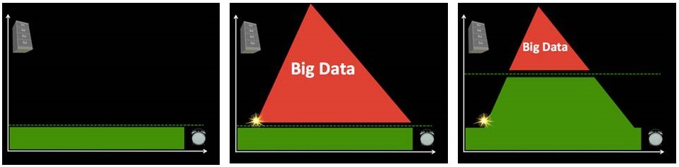
What does Big Data mean in the context of disaster response? Big (Crisis) Data refers to the relatively large volume, velocity and variety of digital information that may improve sense making and situational awareness during disasters. This is often referred to the 3 V’s of Big Data.
Volume refers to the amount of data (20 million tweets were posted during Hurricane Sandy) while Velocity refers to the speed at which that data is generated (over 2,000 tweets per second were generated following the Japan Earthquake & Tsunami). Variety refers to the variety of data generated, e.g., Numerical (GPS coordinates), Textual (SMS), Audio (phone calls), Photographic (satellite Imagery) and Video-graphic (YouTube). Sources of Big Crisis Data thus include both public and private sources such images posted as social media (Instagram) on the one hand, and emails or phone calls (Call Record Data) on the other. Big Crisis Data also relates to both raw data (the text of individual Facebook updates) as well as meta-data (the time and place those updates were posted, for example).
Ultimately, Big Data describe datasets that are too large to be effectively and quickly computed on your average desktop or laptop. In other words, Big Data is relative to the computing power—the filters—at your finger tips (along with the skills necessary to apply that computing power). Put differently, Big Data is “Big” because of filter failure. If we had more powerful filters, said “Big” Data would be easier to manage. As mentioned in previous blog posts, these filters can be created using Human Computing (crowdsourcing, microtasking) and/or Machine Computing (natural language processing, machine learning, etc.).
Click on Image to Enlarge
Take the [first] graph, for example. The horizontal axis represents time while the vertical one represents volume of information. On a good day, i.e., when there are no major disasters, the Digital Operations Center of the American Red Cross monitors and manually reads about 5,000 tweets. This “steady state” volume and velocity of data is represented by the green area. The dotted line just above denotes an organization’s (or individual’s) capacity to manage a given volume, velocity and variety of data. When disaster strikes, that capacity is stretched and often overwhelmed. More than 3 million tweets were posted during the first 48 hours after the Category 5 Tornado devastated Moore, Oklahoma, for example. What happens next is depicted in the [second] graph below.
Humanitarian and emergency management organizations often lack the internal surge capacity to manage the rapid increase in data generated during disasters. This Big Crisis Data is represented by the red area. But the dotted line can be raised. One way to do so is by building better filters (using Human and/or Machine Computing). Real world examples of Human and Machine Computing used for disaster response are highlighted here and here respectively.
A second way to shift the dotted line is with enlightened leadership [third graphic]. An example is the Filipino Government’s actions during the recent Typhoon. More on policy here. Both strategies (advanced computing & strategic policies) are necessary to raise that dotted line in a consistent manner.
See also:
Big Data for Disaster Response: A List of Wrong Assumptions [Link]
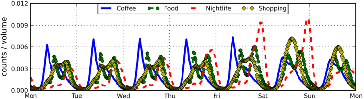
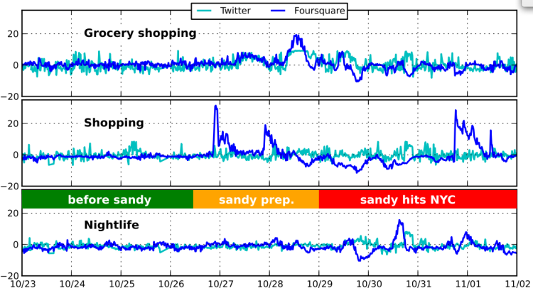
“When rare events at the scale of Hurricane Sandy happen, we expect them to leave an unquestionable mark on Social Media activity.” So the authors applied the same methods used to produce the above graph to visualize and understand changes in behavior during Hurricane Sandy as reflected on Foursquare and Twitter. The results are displayed below .
Click on Image to Enlarge
“Prior to the storm, activity is relatively normal with the exception of iMac release on 10/25. The big spikes in divergent activity in the two days right before the storm correspond with emergency preparations and the spike in nightlife activity follows the ‘celebrations’ pattern afterwards. In the category of Grocery shopping (top panel) the deviations on Foursqaure and Twitter overlap closely, while on Nightlife the Twitter activity lags after Foursquare. On October 29 and 30 shops were mostly closed in NYC and we observe fewer checkins than usual, but interestingly more tweets about shopping. This finding suggests that opposing patterns of deviations may indicate of severe distress or abnormality, with the two platforms corroborating an alert.”
Click on Image to Enlarge
In sum, “the deviations in the case study of Hurricane Sandy clearly separate normal and abnormal times. In some cases the deviations on both platforms closely overlap, while in others some time lag (or even opposite trend) is evident. Moreover, during the height of the storm Foursquare activity diminishes significantly, while Twitter activity is on the rise. These findings have immediate implications for event detection systems, both in combining multiple sources of information and in using them to improving overall accuracy.”
Now if only this applied research could be transfered to operational use via a real-time dashboard, then this could actually make a difference for emergency responders and humanitarian organizations. See my recent post on the cognitive mismatch between computing research and social good needs.