
 Tip of the Hat to Zero Hedge for its post on real-time data but need to look deeper.
Tightest OODA wins, all other things being equal. “Data” today fits the paradigm of disruptive innovation, which start small but often follows an S-curve of adoption and therefore influence and importance.
The events of 2020 pushed “Data” a lot further up the curve than it would have otherwise travelled in a normal year.
RELATED: Geddes @ Phi Beta Iota
Phi Beta Iota: see two links below for a sense of commercial crimes against humanity at scale.
Anna Von Reitz @ Phi Beta Iota
VIDEO (1:01:06) Doug Billings with Charlie Ward and Simon Parkes with Core Supplemental Links
Full Text of Reference Below the Fold
How Real-Time Data Changed Everything
Submitted by Nick Colas of DataTrek
To set the stage for this discussion, I’ll start with the story of when I first considered the intersection of personal technology usage and data gathering. It was 1994, and I had just signed up for AOL through one of those ubiquitous CD-ROM mailers. There was a portal to the World Wide Web (just one icon among many on AOL), and one day I found the People’s Republic of China website. It was one of those crude black print on white background affairs, but at least it was in English. Right at the top of the page was a link to hear Chairman Mao’s address from Tiananmen Square in 1949, announcing the establishment of the PRC.
I hit the link, and Mao’s voice crackled through the computer’s speakers and into my NYC studio apartment, 45 years after they were recorded 6,800 miles away. That’s when I “got” the power of the Internet. But I was also immediately apprehensive. AOL knew I was listening to that. Maybe the Chinese government knew too.
Fast forward to today, and virtually everything about our lives flows through our personal tech devices, the digital exhaust created by our actions as clear as a jet’s contrail against a bright blue sky. Our smartphones know where we are and who we’re with. Our search histories know more about us than our closest friends. Our shopping habits are increasingly concentrated in just a few places (Amazon, Walmart), and a handful of companies know our preferences for everything from entertainment to travel in stark detail.
It took 2020, however, for this fact of modern life to hit prime time when it comes to analyzing, well, pretty much everything. Three examples:
#1: Technology allowed us to measure both social distancing compliance and its effects on the real-world economy virtually anywhere in the world, as well as provide a crowd-sourced way to monitor the spread of the virus. Apple and Google both launched comprehensive public mobility datasets (links below). These allowed local government officials and ordinary citizens alike to line up their town/city’s experience with the virus to how much people were moving around. We’ve used TomTom’s traffic congestion every week for months to assess both the success of lockdowns and subsequent recoveries in economic activity.
And then there’s Google Trends, which measures the number of users searching for a given word or phrase across time. Back when the seasonal flu was the respiratory disease that caused the greatest concern in the US health system, the number of Google searches for common symptoms was invariably a great leading indicator of caseloads in a week’s time.
Now, however, the critical search term to track is “loss of smell”, a common early indication of the virus; here is the Google Trends chart for that term over the last 12 months in the US:
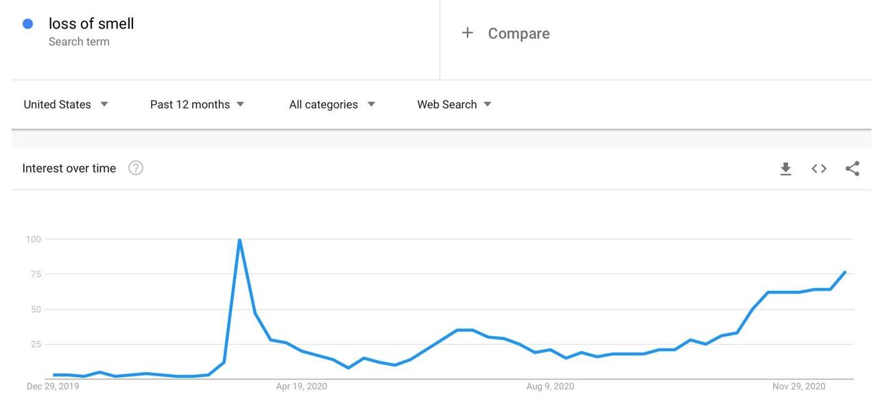
Takeaway: the Pandemic Crisis dramatically increased the utility of analyzing digital data across a wide array of use cases, and even once the virus is no longer an issue this new toolbox will remain highly relevant for other purposes.
* * *
#2: Economic policymakers are (finally) embracing real time data analysis. We have always been confused by how Federal Reserve officials and Wall Street economists persist in using datasets like the first Friday Employment Situation Summary (ESS). It is, after all, merely a survey of a few tens of thousands of people and only about double that number of businesses. In a world where most workers receive their paychecks electronically, that seems anachronistic at best. The only explanation for this oversight I’ve ever heard that makes sense is that economics as a discipline loves its back tests, and at least the ESS’ unemployment rate goes back to 1948.
The speed of 2020’s economic decline and the need to monitor any recovery in real-time has brought new, more comprehensive economic data analysis to the fore, even at the typically hidebound US Federal Reserve. The Dallas Fed has its Mobility and Engagement Index, using SafeGraph smartphone geolocation data. The New York Fed launched its Weekly Economic Index (WEI), which aggregates a host of high-frequency indicators into one flash measure of economic growth.
Here is the latest NY Fed WEI graph, which shows this year’s GDP cadence from January to yesterday:
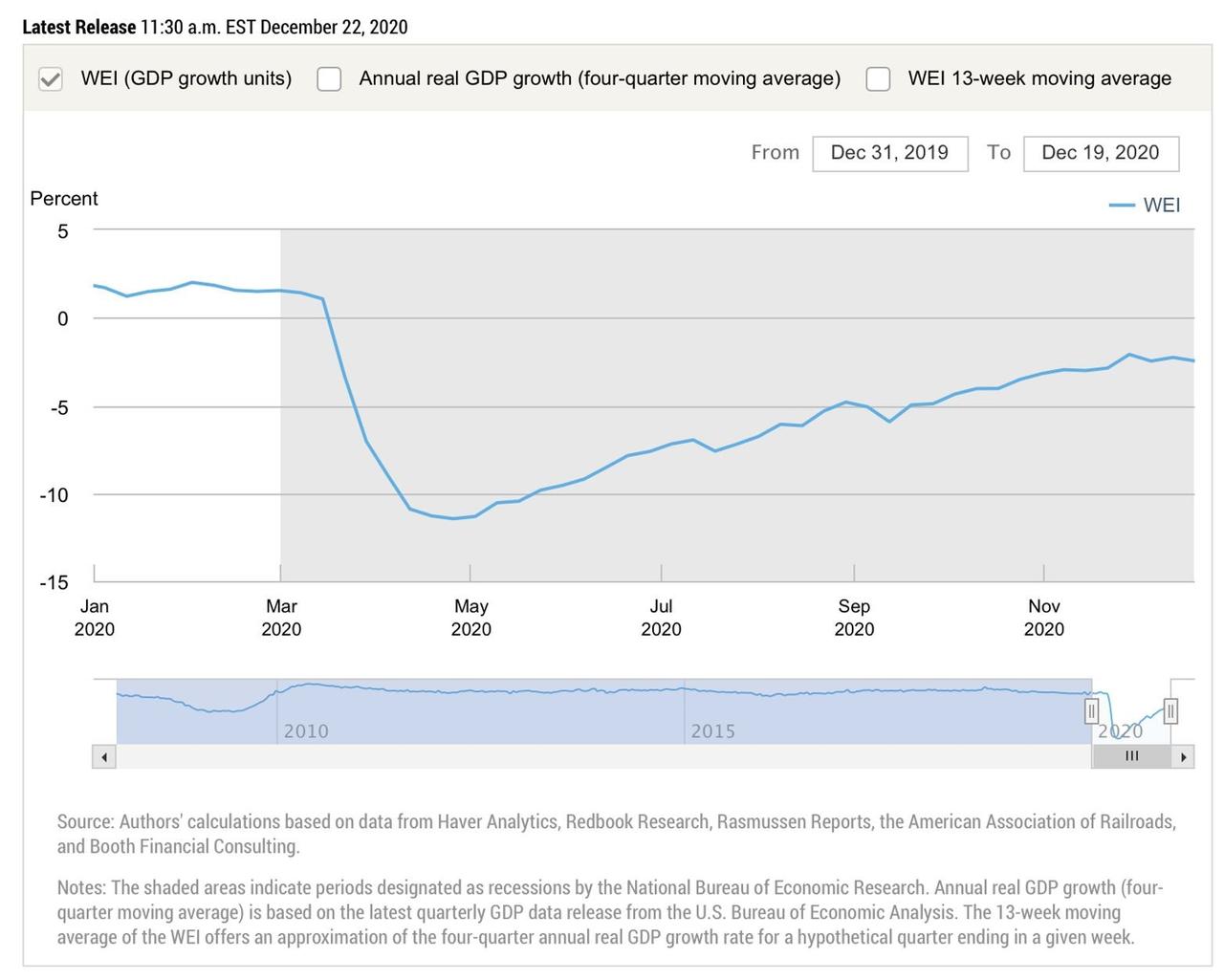
Takeaway: economic policymakers started to embrace novel datasets during 2020 in ways that would have seemed unthinkable just a few years ago. Some use Big Data, others (like the WEI) simply acknowledge that faster feedback from the real economy is useful.
* * *
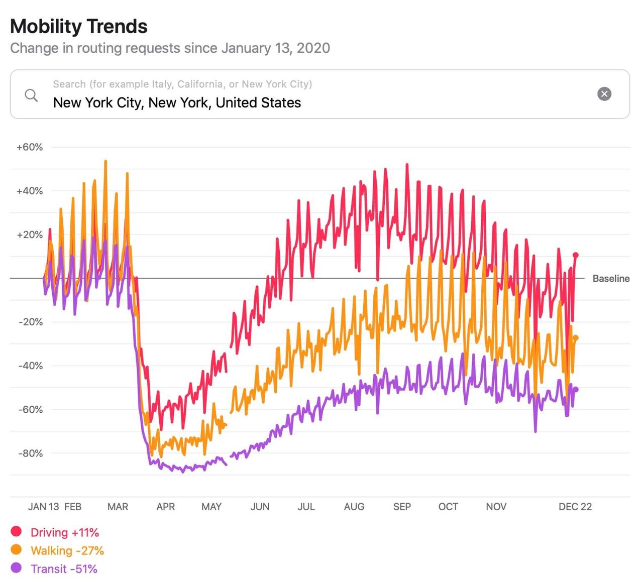
#3: Data will be the only way to rigorously understand when society returns to normal, how long that takes, and what it even looks like. We’ve written about the concentration of US unemployment in New York and Los Angeles, and the Apple Mobility data for each city tells the story.
Here is New York’s 2020 mobility data, where you can see that mass transit usage (purple) is down 51 percent relative to January 13th while driving (red) is up 13 percent. That’s “pandemic normal” – substituting a car in densely populated NYC for public transport – but it is about as far away from “normal normal” as I, a lifelong New Yorker, can imagine.
And here is Los Angeles, which highlights the tremendous inequality of the virus’ economic impact. Driving and walking are both relatively flat, but mass transit (used by the city’s less affluent citizens) is down 53 percent. That indicates to me a lack of employment for these workers, and the BLS data for Los Angeles (10.6 percent unemployment, 58 pct above the national level) supports that view.

Takeaway: just as 2020’s economic recession was not a typical downturn, 2021’s recovery will not adhere to the usual playbook either. Fresh, real time localized data will be the ticket to understanding how the US economy returns to growth and what form that takes. New York’s recovery will look different from Dallas’ or Nashville’s. The national data will obscure those variations, but they will be essential to understanding how the American economy has changed over the last 12 months.
Summing up: “Data” today fits the paradigm of disruptive innovation, which start small but often follows an S-curve of adoption and therefore influence and importance. The events of 2020 pushed “Data” a lot further up the curve than it would have otherwise travelled in a normal year. The year’s central lesson is, therefore, that as much as Data has been important to the analysis of government policy, economics, and capital market trends during the pandemic, it will be a much more visible component of these disciplines coming out of it.
References:
Apple Mobility Data: https://covid19.apple.com/mobility
Google Mobility Report: https://www.google.com/covid19/mobility/
TomTom Traffic Index: https://www.tomtom.com/en_gb/traffic-index/
Dallas Fed Mobility and Engagement Index: https://www.dallasfed.org/research/mei


