Patrick Meier: UN, Social Media, HUMINT, and Geospatial Decision-Support –a REAL Revolution in Intelligence Affairs

Crowd-Sourcing, Geospatial
Patrick Meier

How the UN Used Social Media in Response to Typhoon Pablo

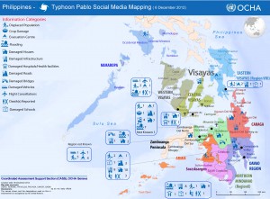
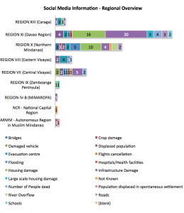
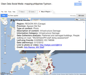
Our mission as digital humanitarians was to deliver a detailed dataset of pictures and videos (posted on Twitter) which depicted the damage and flooding following the Typhoon. An overview of this digital response is available here. The task of our United Nations colleagues at the Office of the Coordination of Humanitarian Affairs (OCHA), was to rapidly consolidate and analyze our data to compile a customized Situation Report for OCHA’s team in the Philippines. The maps, charts and figures below are taken from this official report (click to enlarge).
Click on Image to Enlarge

This map is the first ever official UN crisis map entirely based on data collected from social media.

One of my main priorities now is to make sure we do a far better job at leveraging advanced computing and microtasking platforms so that we are better prepared the next time we’re asked to repeat this kind of deployment. On the advanced computing side, it should be perfectly feasible to develop an automated way to crawl twitter and identify links to images  and videos.
Click on Image to Enlarge

My colleagues at QCRI are already looking into this. As for microtasking, I am collaborating with PyBossa and Crowdflower to ensure that we have highly customizable platforms on stand-by so we can immediately upload the results of QCRI’s algorithms. In sum, we have got to move beyond simple crowdsourcing and adopt more agile micro-tasking and social computing platforms as both are far more scalable.

One of my main priorities now is to make sure we do a far better job at leveraging advanced computing and microtasking platforms so that we are better prepared the next time we’re asked to repeat this kind of deployment. On the advanced computing side, it should be perfectly feasible to develop an automated way to crawl twitter and identify links to images  and videos.
My colleagues at QCRI are already looking into this. As for microtasking, I am collaborating with PyBossa and Crowdflower to ensure that we have highly customizable platforms on stand-by so we can immediately upload the results of QCRI’s algorithms. In sum, we have got to move beyond simple crowdsourcing and adopt more agile micro-tasking and social computing platforms as both are far more scalable.

Visit Original (one additional graphic).

Continue reading “Patrick Meier: UN, Social Media, HUMINT, and Geospatial Decision-Support –a REAL Revolution in Intelligence Affairs”

Patrick Meier: US AID Crisis Map of Syria

Geospatial
Patrick Meier

Why USAID’s Crisis Map of Syria is so Unique

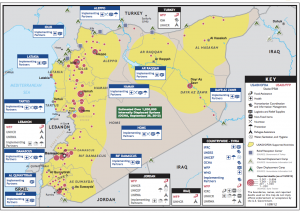
While static, this crisis map includes a truly unique detail. Click on the map below to see a larger version as this may help you spot what is so striking.

For a hint, click this link. Still stumped? Look at the sources listed in the Key.

ANSWER from Patrick Meier:  AID map uses Syria Tracker as a source for Reported Deaths.

Previously posted:

Patrick Meier: Crisis Mapping Syria – Automated Data Mining and Crowdsourced Human Intelligence

Click on Image to Enlarge

Patrick Meier: Using E-Mail Data to Estimate International Migration Rates

Citizen-Centered, Geospatial, Geospatial
Patrick Meier

Using E-Mail Data to Estimate International Migration Rates

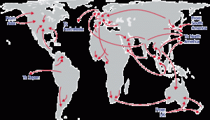
As is well known, “estimates of demographic flows are inexistent, outdated, or largely inconsistent, for most countries.” I would add costly to that list as well. So my QCRI colleague Ingmar Weber co-authored a very interesting study on the use of e-mail data to estimate international migration rates.

The study a large sample of Yahoo! emails sent by 43 million users between September 2009 and June 2011. “For each message, we know the date when it was sent and the geographic location from where it was sent. In addition, we could link the message with the person who sent it, and with the user’s demographic information (date of birth and gender), that was self reported when he or she signed up for a Yahoo! account. We estimated the geographic location from where each email message was sent using the IP address of the user.”

Click on Image to Enlarge

The authors used data on existing migration rates for a dozen countries and international statistics on Internet diffusion rates by age and gender in order to correct for selection bias. For example, “estimated number of migrants, by age group and gender, is multiplied by a correction factor to adjust for over-representation of more educated and mobile people in groups for which the Internet penetration is low.” The graphs below are estimates of age and gender-specific immigration rates for the Philippines. “The gray area represents the size of the bias correction.” This means that “without any correction for bias, the point estimates would be at the upper end of the gray area.” These methods “correct for the fact that the group of users in the sample, although very large, is not representative of the entire population.”

Continue reading “Patrick Meier: Using E-Mail Data to Estimate International Migration Rates”

Patrick Meier: Twitter Maps and Videos Showing Hurricane Sandy in Real-Time, with Geospatial and Substance Tags

Crowd-Sourcing, Geospatial
Patrick Meier

The Most Impressive Live Global Twitter Map, Ever?

My colleague Kalev Leetaru has just launched The Global Twitter Heartbeat Project  in partnership with the Cyber Infrastructure and Geospatial Information Laboratory (CIGI) and GNIP. He shared more information on this impressive initiative with the CrisisMappers Network this morning.

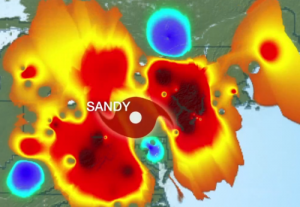
According to Kalev, the project “uses an SGI super-computer to visualize the Twitter Decahose live, applying fulltext geocoding to bring the number of geo-located tweets from 1% to 25% (using a full disambigua-ting geocoder that uses all of the user’s available information in the Twitter stream, not just looking for mentions of major cities), tone-coding each tweet using a twitter-customized dictionary of 30,000 terms,

Click on Image to Enlarge

and applying a brand-new four-stage heatmap engine (this is where the supercomputer comes in) that makes a map of the number of tweets from or about each location on earth, a second map of the average tone of all tweets for each location, a third analysis of spatial proximity (how close tweets are in an area), and a fourth map as needed for the percent of all of those tweets about a particular topic, which are then all brought together into a single heatmap that takes all of these factors into account, rather than a sequence of multiple maps.”

Kalev added that, “For the purposes of this demonstration we are processing English only, but are seeing a nearly identical spatial profile to geotagged all-languages tweets (though this will affect the tonal results).” The Twitterbeat team is running a live demo showing both a US and world map updated in realtime at Supercomputing on a PufferSphere and every few seconds on the SGI website here.”

Read full post with two embedded short videos.

Continue reading “Patrick Meier: Twitter Maps and Videos Showing Hurricane Sandy in Real-Time, with Geospatial and Substance Tags”

GI Wilson: Sandy Situation on Google Crisis Map, USMC and USN Helping — Sea Bees and Red Hats Not Visible

Geospatial
Col GI Wilson, USMC (Ret)

We do have active duty Marines from 26 MEU and CLB….why the SeaBees Gurad, and DOD are not setting up tent camps is beyond me unless DHS-FEMA wants to re-do the trailer cities it did for Kartinia but way too late……suspect there is turf battles going on……what are the unions doing???Hmmmmmm!

Click on Image to Enlarge

Below is URL for a useful Google crisis map with multiple icons that can be turned on and off.  Western Long Island and the entire coastal area north and south of New York City is the center of gravity for aid that is NOT getting here as quickly and coherently as it should, AND we have another storm on the way for which few are ready.

http://google.org/crisismap/sandy-2012

Patrick Meier: Crowdsourcing the Evaluation of Post-Sandy Building Damage Using Aerial Imagery

Geospatial
Patrick Meier

Crowdsourcing the Evaluation of Post-Sandy Building Damage Using Aerial Imagery

My colleague Schuyler Erle from Humanitarian OpenStreetMap  just launched a very interesting effort in response to Hurricane Sandy. He shared the info below via CrisisMappers earlier this morning, which I’m turning into this blog post to help him  recruit more volunteers.

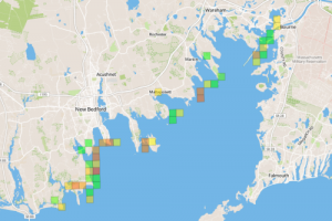
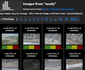
Schuyler and team just got their hands on the Civil Air Patrol’s (CAP) super high resolution aerial imagery of the disaster affected areas. They’ve imported this imagery into their Micro-Tasking Server MapMill created by Jeff Warren and are now asking volunteers to help tag the images in terms of the damage depicted in each photo. “The 531 images on the site were taken from the air by CAP over New York, New Jersey, Rhode Island, and Massachusetts on 31 Oct 2012.”

Click on Image to Enlarge

To access this platform, simply click here: http://sandy.hotosm.org.

Click on Image to Enlarge

“For each photo shown, please select ‘ok’ if no building or infrastructure damage is evident; please select ‘not ok’ if some damage or flooding is evident; and please select ‘bad’ if buildings etc. seem to be significantly damaged or underwater. Our *hope* is that the aggregation of the ok/not ok/bad ratings can be used to help guide FEMA resource deployment, or so was indicated might be the case during RELIEF at Camp Roberts this summer.”

A disaster response professional working in the affected areas for FEMA replied (via CrisisMappers) to Schuyler’s efforts to confirm that:

Continue reading “Patrick Meier: Crowdsourcing the Evaluation of Post-Sandy Building Damage Using Aerial Imagery”