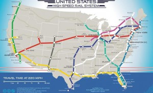
![]() The future of high-speed rail in the U.S. remains anything but certain, but in the meantime one person has taken it upon himself to show us what it should look like.
The future of high-speed rail in the U.S. remains anything but certain, but in the meantime one person has taken it upon himself to show us what it should look like.
Activist and artist Alfred Twu began working on the map in 2009, in response to President Obama’s plan for high-speed rail. The map has gone viral on Facebook, and a petition Twu created to ask the White House to fund a system like the one he proposed has already received 52,389 signatures.

In designing the map’s routes, Twu relied on studies from government agencies and advocacy groups. He said such a system could be built out like the Interstate Highway System.
“Some artistic license was applied to make it more elegant and have it be a series of distinct lines like a subway map,” he said. “Colors were selected to convey the idea of the U.S. being made up of several interwoven regional cultures that come together at major cities — like an internal melting pot.”
According to Twu, a rail system like the one he’s designed would cost $1 – $2 trillion to build. “Sounds like a lot,” he said, “but divided over four decades, that is around $25-$50 billion a year or 80-160 dollars a year per person. That’s one tank’s worth of gas money.”
Readers, should the U.S. be investing in high-speed rail? Or, considering the country’s persistent economic hardships, is this an unnecessary diversion that would distract us from more important issues?
View a larger version of the map here.


