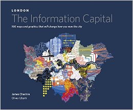
James Cheshire and Oliver Uberti
5.0 out of 5 stars From coffee table to scientific salon, a worthy offering, November 4, 2014
This is a spectacular offering on multiple fronts. On the low-end, it has got to be the coolest coffee table book around, something that could be usefully offered in every waiting room across London — and hopefully inspire copycats for other cities including Paris and New York and Dubai.
At the high end, the book offers the most current available understanding of just what can be gleaned from “big data” that is available from open databases — one can only imagine the additional value to be had from closed data bases (money movement, for example). And of course we have to persist in our demands that all data and the software and hardware needed to process the data be open source so that it is affordable, interoperable, and scalable.
To evaluate the book, look online for the following article that provides a series of extracted color maps along with textual information that in my view help make the purchasing decision here, for those that can afford to buy another book, quite easy:
< These Maps Visualize London's 2.4 Billion Bus Journeys In A Whole New Way >
Here are some other data visualization books that I find quite inspiring:
Geo-Informatics in Resource Management and Sustainable Ecosystem: International Symposium, GRMSE 2013, Wuhan, China, November 8-10, 2013, Proceedings, … in Computer and Information Science)
Smart Cities: Big Data, Civic Hackers, and the Quest for a New Utopia
Designing Data Visualizations: Representing Informational Relationships
The Visual Display of Quantitative Information
The Visual Organization: Data Visualization, Big Data, and the Quest for Better Decisions (Wiley and SAS Business Series)
A History of the World in 12 Maps
A History of the Twentieth Century in 100 Maps
Cool Infographics: Effective Communication with Data Visualization and Design
Cartography: Visualization of Geospatial Data
Information Dashboard Design: Displaying Data for At-a-Glance Monitoring
Best wishes to all,
Robert David STEELE Vivas
INTELLIGENCE FOR EARTH: Clarity, Diversity, Integrity, & Sustainability


